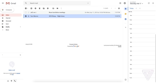
Google's New Gmail Web Interface Leaks With Hints Of Material Design
Today, we're getting our first glimpse at this new user interface courtesy of screenshots that were gathered by The Verge. Regular Gmail users will feel right at home with the redesign, as it doesn’t stray toofar from the current look. However, Google has made some tweaks to bring Gmail's user interface more in line with the corporate Material Design philosophy.
The biggest visual change, however, is probably the adoption of a new sidebar that takes up residence on the right-hand side of the screen. The sidebar houses quick access to Google Calendar the Google Keep note-taking app and Google Tasks. Clicking on the icon for one of the aforementioned apps brings up a cut-down version that is viewable side-by-side with your inbox view.
There will be three design layouts that users can choose from, "including a default view that highlights attachments like documents and photos, a comfortable view that doesn’t highlight attachments, and a compact view that increases the amount of messages you can see on a single page."
As we reported yesterday, Gmail mobile app features like Smart Reply and Snooze are now prominently featured in the web interface. In addition, native offline support has been added into the mix.
We're still expecting to see this new design popup as a preview for G Suite and regular Gmail users in the coming weeks.


