Interactive Map Of The Universe Shows Our Vast, Beautiful Cosmos In Striking Detail
Scientists and astronomers continue to explore the Universe, as spacecraft such as the James Webb Space Telescope (JWST) provide images with higher resolution than ever before. While the everyday explorer has been able to view many of the new images that are being transmitted back to Earth, there is a lot of data that has only been privy to scientists, until now. A new interactive map has unlocked the ability to explore the universe in a way that depicts the actual position and real colors of around 200,000 galaxies.

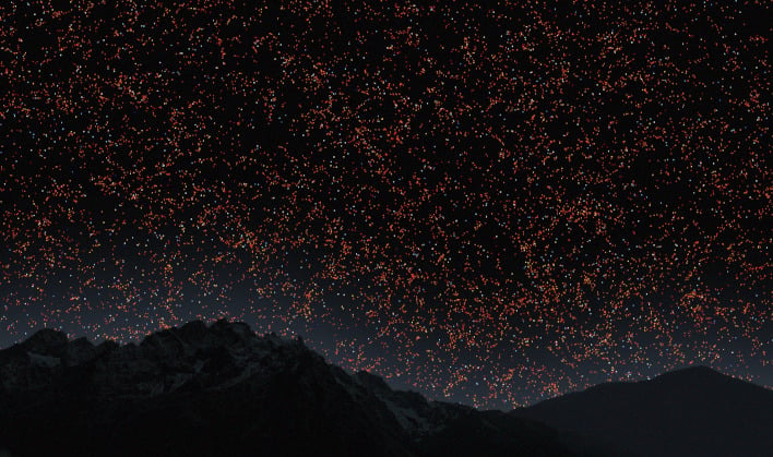
The map shown above is a slice of our Universe, and was created from astronomical data collected over a 15-year period using a telescope in New Mexico, USA. Earth is located at the bottom of the image, with the "actual edge of the observable Universe" located at the top. There are approximately 200,000 galaxies located in between.
A full map would actually be a sphere, with the visualization shown being a thin slice of the Universe. The creators state that the thickness of the slice is about 10 degrees. While more astronomical data is available, it is not possible to display it all at once on a 2D map. An image of this nature would be completely saturated with dots.

"In this map, we are just a speck at the very bottom, just one pixel. And when I say we, I mean our galaxy, the Milky Way which has billions of stars and planets," explained Menard. "We are used to seeing astronomical pictures showing one galaxy here, one galaxy there or perhaps a group of galaxies. But what this map shows is a very, very different scale."
If you would like to explore this expansive and incredibly detailed view of the known Universe, you can do so by visiting the Map of the Universe website.