Microsoft Looks Back At The Path Of Windows, Waves Goodbye To Aero
Windows 8 is coming this year. At this point, it's accepted. It's almost taken for granted. But building an entire operating system is an insane job, and doing it time and time again is even crazier. Microsoft has been pounding away at desktop OSes for years, and with Win8 on the horizon, the company recently took a step back to show where it's at, where it's going and how we got here. In a new MSDN post entitled 'Creating the Windows 8 user experience,' the company lays out some of the vital UI changes from Windows 1 to Windows 7, and what its engineers learned along the way. A lot of evolution has happened over the years, and it's obvious just looking back at the home screens from each system.
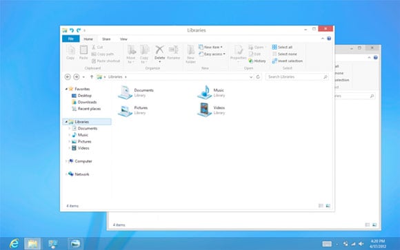
Focusing more on the here and now, the company admits that it is "moving beyond Aero, flattening surfaces, removing reflections, and scaling back distracting gradients." So, largely, Aero won't be a part of Windows 8. The company says that while that was en vogue in the past, we're beyond it now. And while much of the Metro style UI uses white text on a colorful saturated background, the desktop in Windows 8 will continue to use black text on light-colored chrome, as in Windows 7. This choice was made, according to Microsoft, to help preserve maximum compatibility with existing programs. Interesting in hearing more from the brains that designed Win8?
Listen up:
"We applied the principles of “clean and crisp” when updating window and taskbar chrome. Gone are the glass and reflections. We squared off the edges of windows and the taskbar. We removed all the glows and gradients found on buttons within the chrome. We made the appearance of windows crisper by removing unnecessary shadows and transparency. The default window chrome is white, creating an airy and premium look. The taskbar continues to blend into the desktop wallpaper, but appears less complicated overall.One thing strikes us here: Microsoft is clearly listening to consumers. We live in a social world, and input is easier to give and easier to receive than ever before. Windows 8 is going to be a tough one, bridging the gap between a "traditional" desktop OS and a Metro universe, but it's clear that the company is eager to listen and eager to deliver something compelling. Just a few more months, and it'll be out in the wide open.
To complete the story, we updated the appearance of most common controls, such as buttons, check boxes, sliders, and the Ribbon. We squared off the rounded edges, cleaned away gradients, and flattened the control backgrounds to align with our chrome changes. We also tweaked the colors to make them feel more modern and neutral. While a few of these visual changes are hinted at in the upcoming Release Preview, most of them will not yet be publicly available. You’ll see them all in the final release of Windows 8!"