Skype Ditches Snapchat-Inspired Makeover To Focus On Simplicity
Last summer Skype announced with some fanfare that it had overhauled its design. The design was very similar to Snapchat, and many Skype users didn’t like the change. Skype has now announced that after more than a year on the new design, it is changing back to a much simpler interface. Skype is also ditching its interpretation of Snapchat stories called Highlights.
 w
wHighlights allowed users on a mobile device to swipe up to open the smartphone camera where they could take a photo or record video to share. They were then able to decorate the media with text or stickers and shared with Skype users, groups, or posted to the app's Highlights section. Skype has faced the harsh reality that no one wanted many of the features that it had added in its update. Microsoft admitted that Highlights didn’t "resonate" with Skype users and that it decided to simplify. The simplification was needed says Microsoft because features that users wanted to use like placing calls was harder to execute.

The new simplified navigation will focus on Skype fundamentals like making calls with or without video and sending messages. Microsoft notes that the new navigation model will remove redundant and underused features that create clutter on the interface. The mobile interface will have three buttons at the bottom of the app: Calls, Chats, and Contacts. If you happen to have Highlights that you want to keep Microsoft will allow you to download them until September 30, 2018.

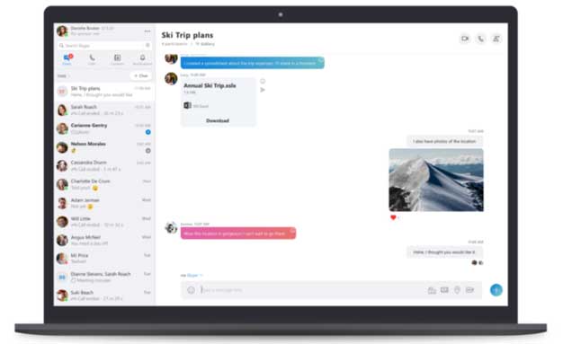
Desktop users will see a navigation menu that will be familiar to mobile users with buttons for Chats, Calls, Contacts, and Notifications on the top left of the Skype Window. Microsoft says that layout will be easy for long-time Skype users to understand. Microsoft also notes that its data shows that Contacts isn’t a frequently used entry point for most Skype users, but some find that feature to be critical and updates for simplicity in the new design make it easier to use.
A modern look and feel give users the option to choose colors. Anyone who uses Skype in a dark room (and their retinas) will appreciate color options other than white. Skype is rolling out a "Classic" blue theme adjusted for contrast and readability along with dark themes. Some decorative elements not core to the Skype user experience, such as notifications with a squiggle shape cutout, are gone in the redesign. Microsoft ends by noting that it worked closely with Skype customers to develop the new design and that it will be listening to feedback in the future.