Watch Apple’s Original iPhone Prototypes With Competing Touch Interfaces From Tony Fadell And Scott Forstall
Apple recently celebrated the 10-year anniversary of when it introduced its first iPhone model, which took place at Macworld 2007 in San Francisco. It was an ambitious product that ultimately shaped the smartphone sector into what it is today, and part of the reason is because Steve Jobs gambled on a design that was very different from the iPod touch. It was a design featured on one of two early prototype iPhone handsets, the P1 and P2, from two competing teams—one led by Tony Fadell, the Godfather of the iPod, and the other by Scott Forsall, a software engineer who had been working with Jobs since NeXT.
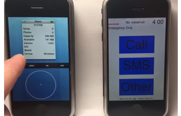
The P1 project led by Fadell resulted in an iPhone model that paired an iPod interface with a touch screen handset. It is not surprising that Fadell chose that path for his team, as the iPod was a monumental success and one of the hottest selling gadgets at the the time. Staying true to form, the P1 featured a virtual click wheel for navigating through menus. Anyone familiar with operating an iPod—and many were—would have no trouble transitioning to a handset based on the P1's design.
Forsall took his team in a different direction. The P2 project that would go on to become the original iPhone used icons to interact with and navigate the UI rather than a scroll wheel. A video making the rounds shows the P1 and P2 in a side-by-side comparison and demonstrates the difference in UI design between the two handsets, with the P2 looking a lot more rudimentary and less polished. However, Jobs saw the potential of the P2, and of course the rest is history.
The video speaks to the genius that was Jobs. Not only was the P2 less polished, it also took significantly longer to boot. Both projects ran what is known as Acorn OS and both used the same hardware, but the P2 took longer because it was designed with a real OS.
Neither one was fleshed out or all that functional. The P1 consisted of a virtual click wheel at the bottom, a black bar with media controls dividing the screen in half, and a menu system up top. As for the P2, it booted into an interface with three buttons—Call, SMS, and Other. Each one would bring up a new screen with more buttons. Though it was rough around the edges, it won the competition and morphed into the iPhone that Jobs gleefully introduced a decade ago.