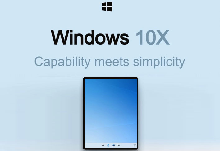
Leaked Windows 10X UI Has macOS And Chrome OS Design Undertones
Windows 10X is reportedly targeted to be Microsoft's optimized operating system for dual and single screen mobile devices like Microsoft's Surface Duo or traditional hybrid 2-in-1 laptops. As rumors and features begin to trickle out, so too do images and renders of what the Windows 10X user interface is supposed to look like. We have gotten a glimpse of what Windows 10X will roughly look like in the past, but some new imagery floating about Twitter seems to reaffirm Remond's new mobile device UI.
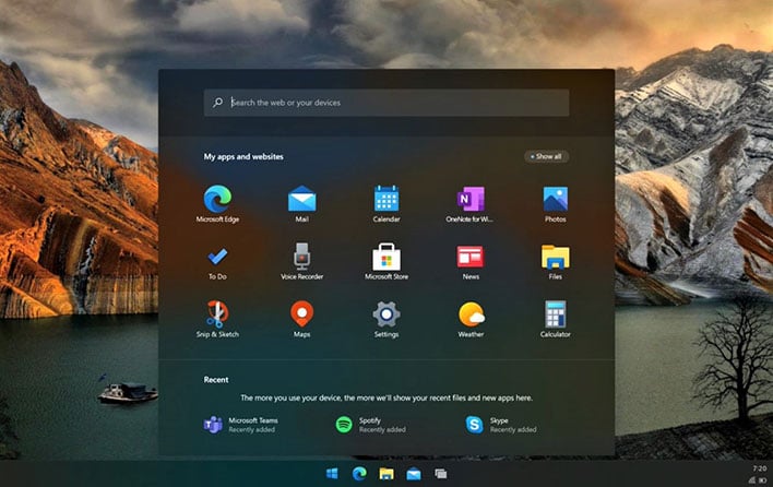
Earlier today, Zac Bowden of Windows Central tweeted out what he called the "first look at Windows 10X for single-screen PCs." It features a redesigned Start Menu that lies in the middle of the screen and all the application icons below it. Overall, it sort of looks like a cross between ChromeOS and macOS, but take a look and decide for yourself below.
Here's your first look at Windows 10X for single-screen PCs. I should hopefully have more to share very soon :) pic.twitter.com/irkbMC5w5n
— Zac Bowden (@zacbowden) January 13, 2021