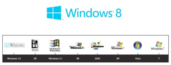
Microsoft Unveils New Windows Logo: Bold Moves, Metro-Inspired
Microsoft knows the times are changing, and change they will. With Metro taking over in Windows 8, it's about time we saw the refreshed logo for the next major step in the evolution of Windows. This is it. This is the redesigned Windows logo, and honestly, it looks almost nothing like the prior "flag." In fact, this one isn't designed to be a flag. It's meant to be a window -- get it, Windows? Here's the official line from the company:
"The Windows logo is a strong and widely recognized mark but when we stepped back and analyzed it, we realized an evolution of our logo would better reflect our Metro style design principles and we also felt there was an opportunity to reconnect with some of the powerful characteristics of previous incarnations.

We had a very short list of agencies that we wanted to work with on the redesign of the logo and were thrilled when Pentagram agreed to join us in the project. Pentagram’s illustrious history speaks for itself, but we were particularly attracted to their sense of classic graphic design which fit well with our Metro design principles."

At the end of the day, it's just a logo, but it's really saying a lot about the direction that Microsoft is headed. Tiles are in; is the Start menu headed out?
"The Windows logo is a strong and widely recognized mark but when we stepped back and analyzed it, we realized an evolution of our logo would better reflect our Metro style design principles and we also felt there was an opportunity to reconnect with some of the powerful characteristics of previous incarnations.

We had a very short list of agencies that we wanted to work with on the redesign of the logo and were thrilled when Pentagram agreed to join us in the project. Pentagram’s illustrious history speaks for itself, but we were particularly attracted to their sense of classic graphic design which fit well with our Metro design principles."

At the end of the day, it's just a logo, but it's really saying a lot about the direction that Microsoft is headed. Tiles are in; is the Start menu headed out?

